
Inner Circle
UX/UI Case Study · Moneysurfers · 2026
The investor club WebApp
Rethought the end-to-end product journey to increase upgrade conversion
Role: UX research & UI design | Scope: Public home, tier dashboards, products, calendar | Platforms: Desktop & mobile web | Tools: Figma · Microsoft Clarity · Jira · Confluence
01 · Context
A product that grew faster than its interface
Inner Circle is a subscription club inside the Moneysurfers web app. Members get an investor-profile quiz, a monthly market deep dive, financial-product and stock analyses, events and, at the top tier, a curated deal room. Everything is educational, never financial advice.
The club launched in January 2026 and moved to three paid tiers (Essential, Pro, Retreats) in April. Features shipped one at a time, each with different access rules per tier. The interface hadn't kept up.
02 · Problem
Users weren’t upgrading for two reasons:
The content didn’t offer enough perceived value to justify the upgrade.
The key content was locked behind a paywall, based on the assumption that it would drive upgrades. However, users weren’t even engaging with it.
I reviewed every live screen against its tier and annotated what got in the way, then checked it against how members really used the club:
134 members across 200 recorded sessions in just over five weeks (23 May – 30 Jun 2026)Three main reasons were blocking clients from upgrading
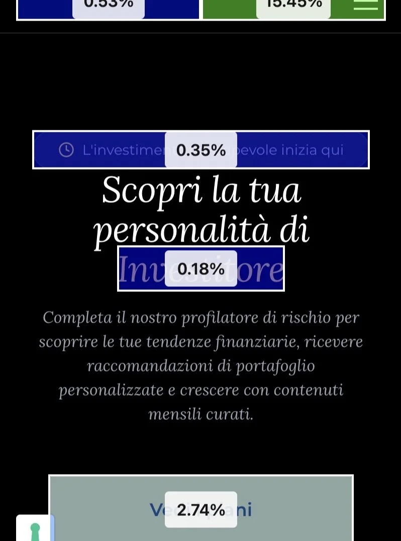
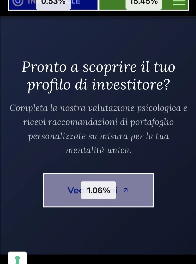
There was no main page explaining the product
Registered MS users can open Inner Circle from the MS app, but the main page doesn’t explain it well enough or convert visitors.
22%
of sessions opened the main page and left without a click after a median of 5 seconds.
A profile that led nowhere
The client's first step is to complete the profiler to understand what drives their investment energy, but the profiler results of Inner Circle ended up meaningless, with a list of next steps and two buttons, "Rifai il test" and "Torna alla home".
The most personal moment in the product had no next action.
77%
Users abandoned the section to read the Deep Dive without converting
Empty locks instead of value
On the first two type of subscritpion dashboard, the sections of Club Deals and Stock Analysis showed as blurred boxes with a padlock and "Contenuto riservato".
Members saw a wall, not a reason to upgrade.
94%
of members never opened pricing.
Only 2% reached checkout.
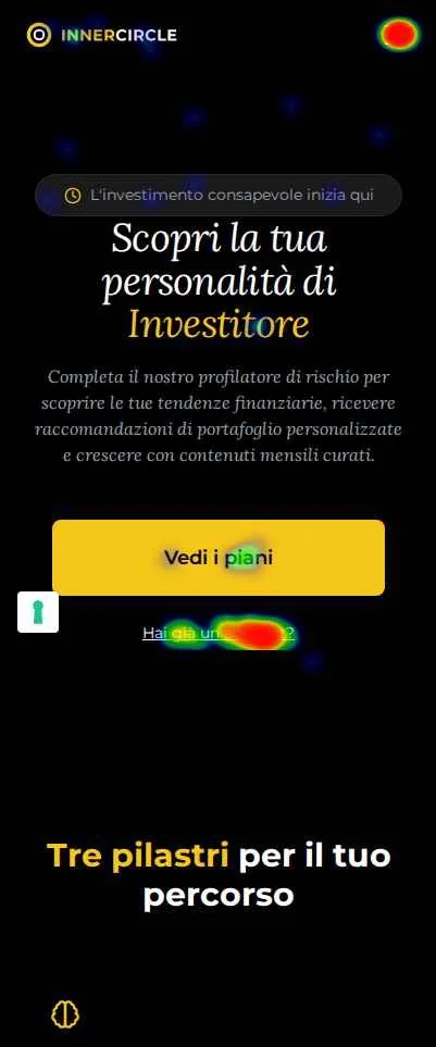
Their main page didn’t fully explain the product, so visitors weren’t converting.
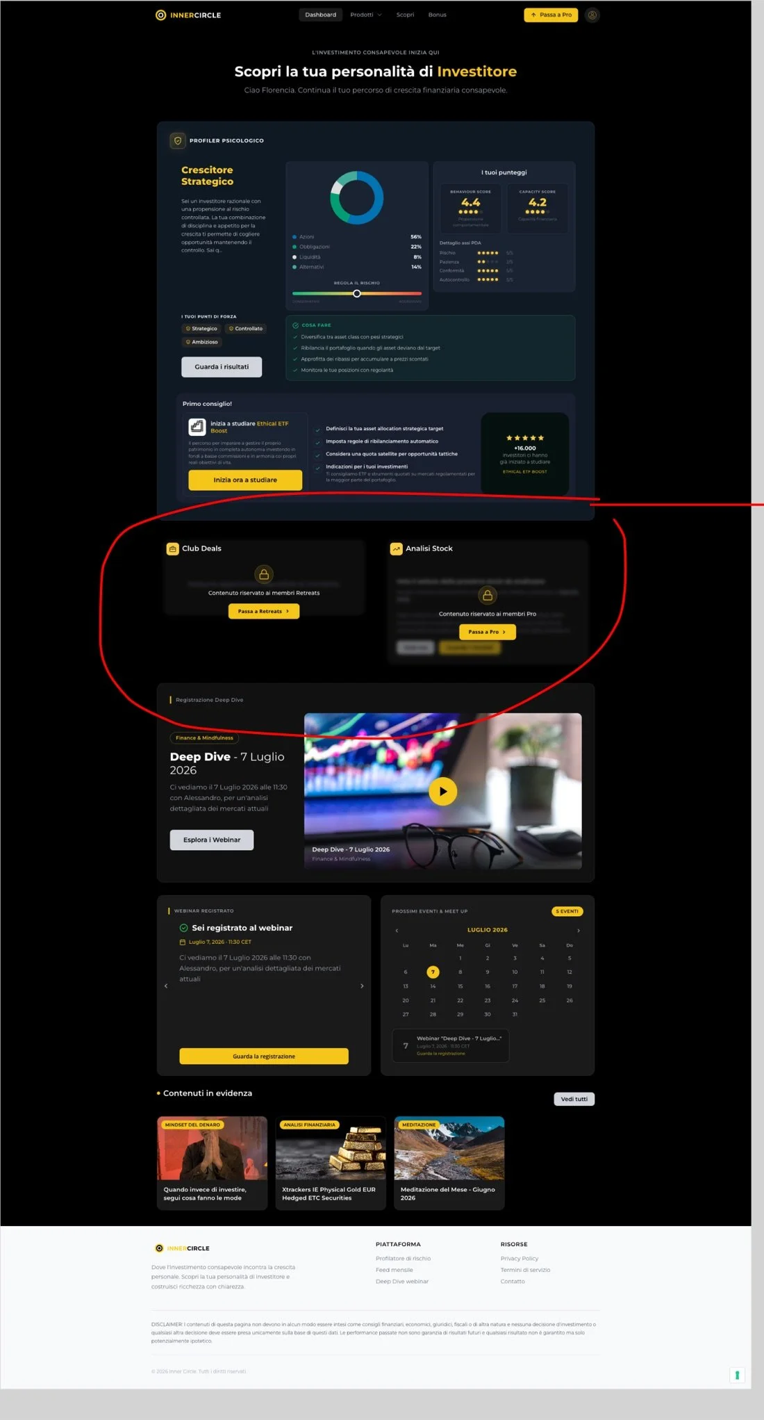
How the dashboard block visitors
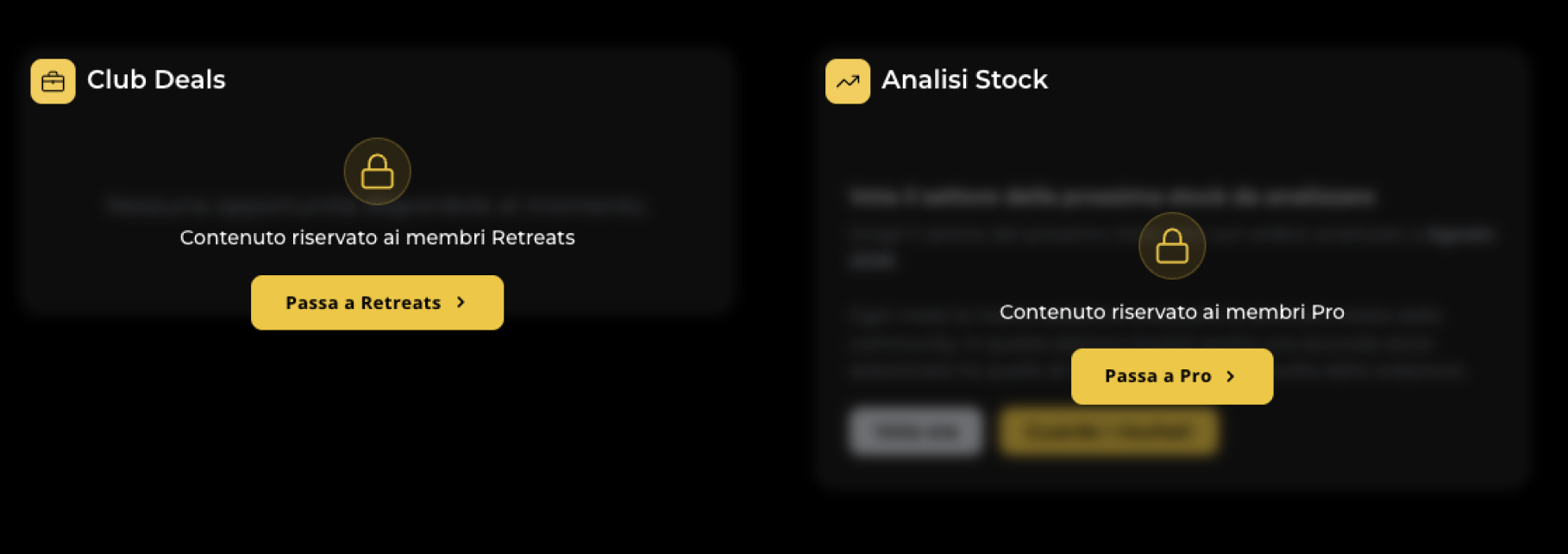
Members saw a wall, not a reason to upgrade.
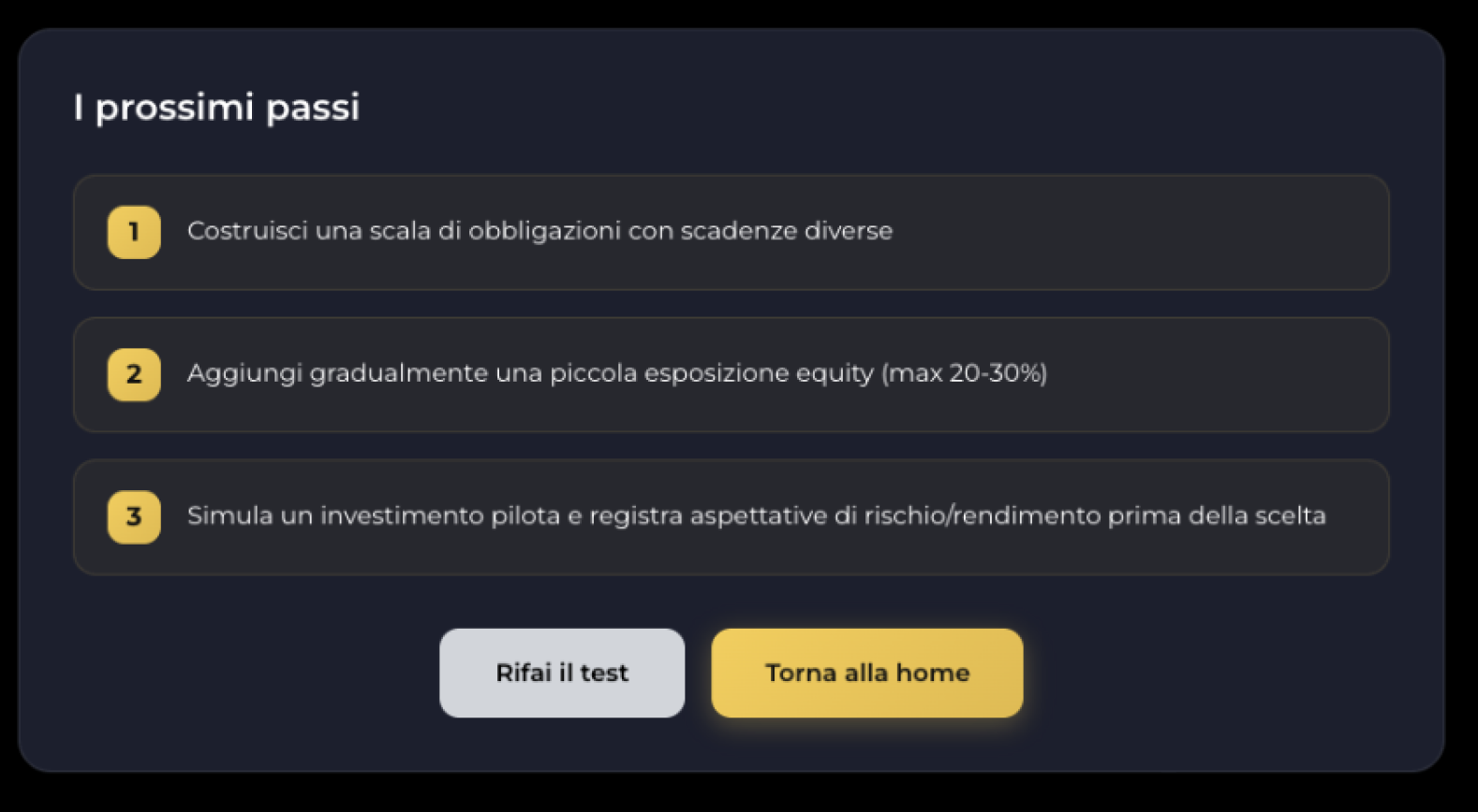
The most personal moment in the product had no next action.
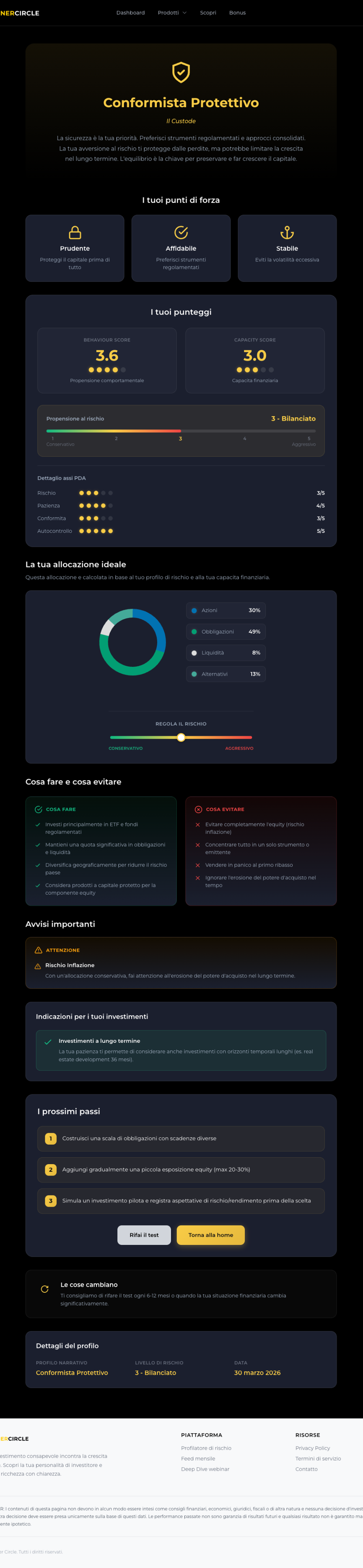
User investment Profiler
03 · Users
Real clients as testers
Inner Circle was offered to different types of clients.

Direct subscribers
Joined from the public page or a webinar, paying monthly or yearly.

Course clients (gift)
Ethical ETF Boost and Ethical Spread Boost buyers, with 3 months of Essential included in the bundle.
The course clients became our testers
Their journey had its own flow: an email with a gift code, registration, a €0 checkout, a welcome email, and a reminder before the end of the gift period.
04 · Research
What we learned from them and that design?
Behaviour over opinion. Early member surveys got almost no answers, so I relied on Microsoft Clarity recordings and heatmaps to see what people actually did.
The profile is the hook. The investor-personality quiz leads the public page and drives personalisation, so the experience should start there.
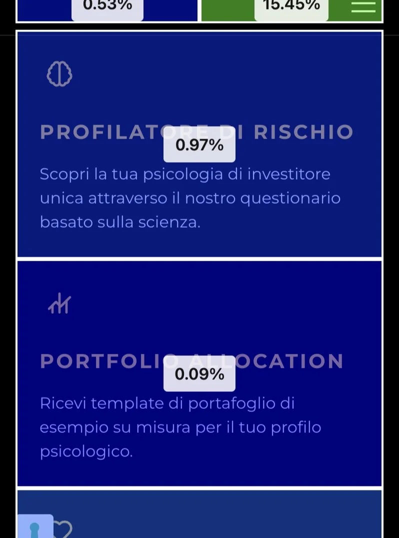
Members used the club, but didn't look up. In 200 recorded sessions from late May to June 2026, 94% of members used the dashboard and content without ever opening pricing. Only 6% showed interest in upgrading, and 2% reached checkout.
05 · Approach
Design principles
One principle for each problem.
1
Explain before you sell
A main page that says what Inner Circle is before asking for anything: the investor-profile hook, the problems it solves, three pillars, three steps to start, and the plans.
2
Every result leads to an action
New members are welcomed and invited to build their profile first. The profile should then turns into concrete next steps, a recommended course, ETF portfolios and events.
3
Show, don't lock
Members see the real content of the higher tiers (deals, status, votes) instead of an empty padlock, on product pages that share one template, with a direct upgrade to the top tier.
06 · Solution


