
Moneysurfers Onboarding WebApp
A learning platform that meets every user at their real level of financial knowledge
THE CHALLENGE
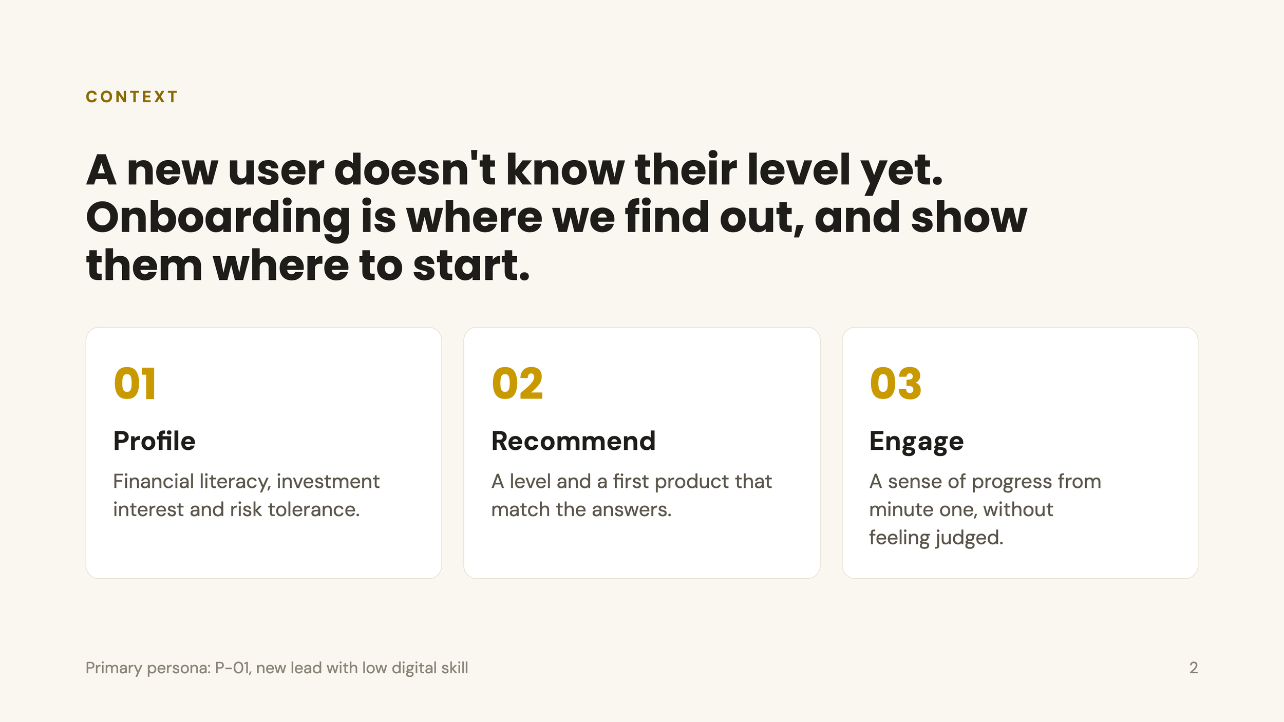
A new user doesn't know their level yet. Onboarding is where we find out, and show them where to start.
What we improved
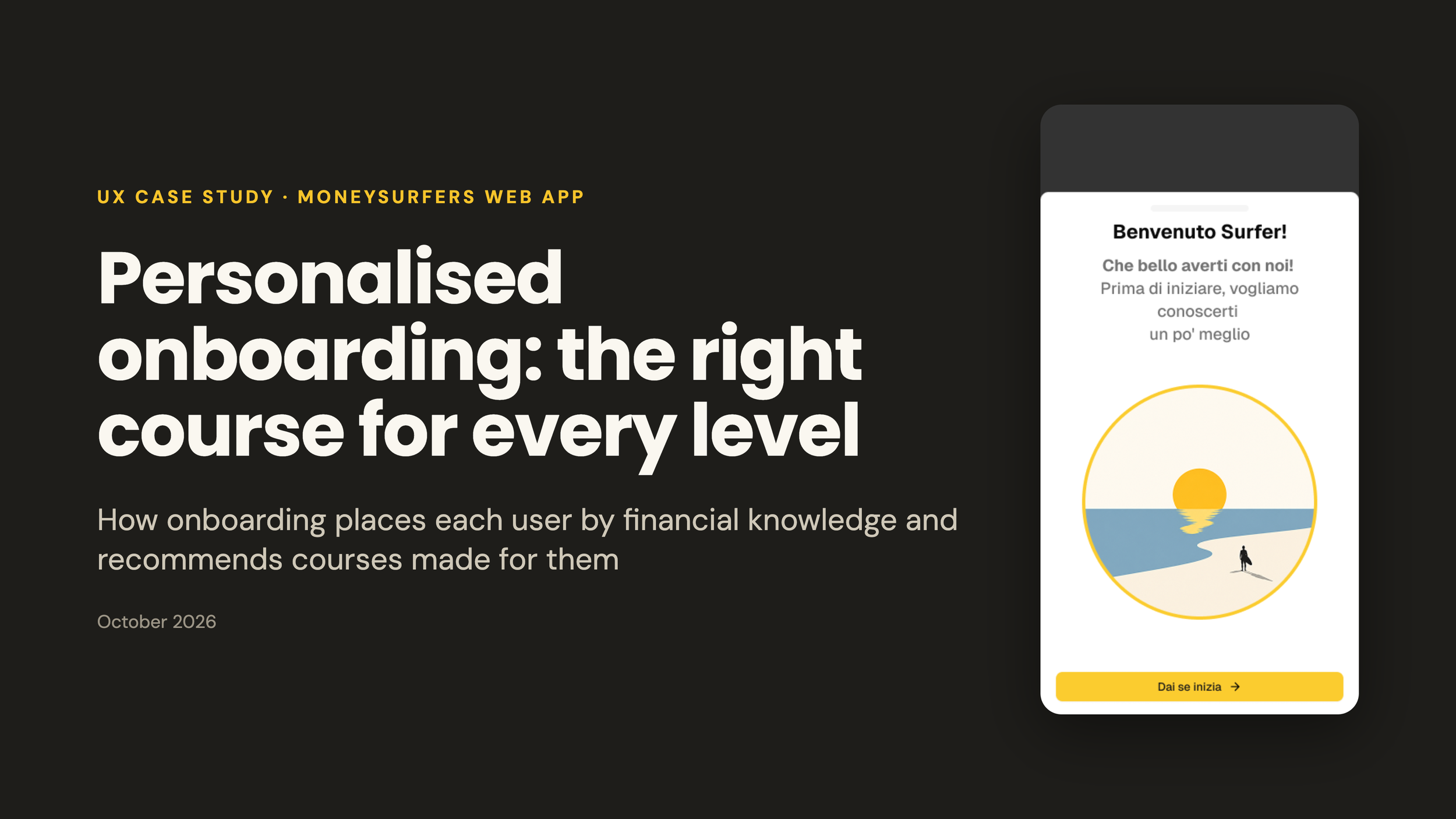
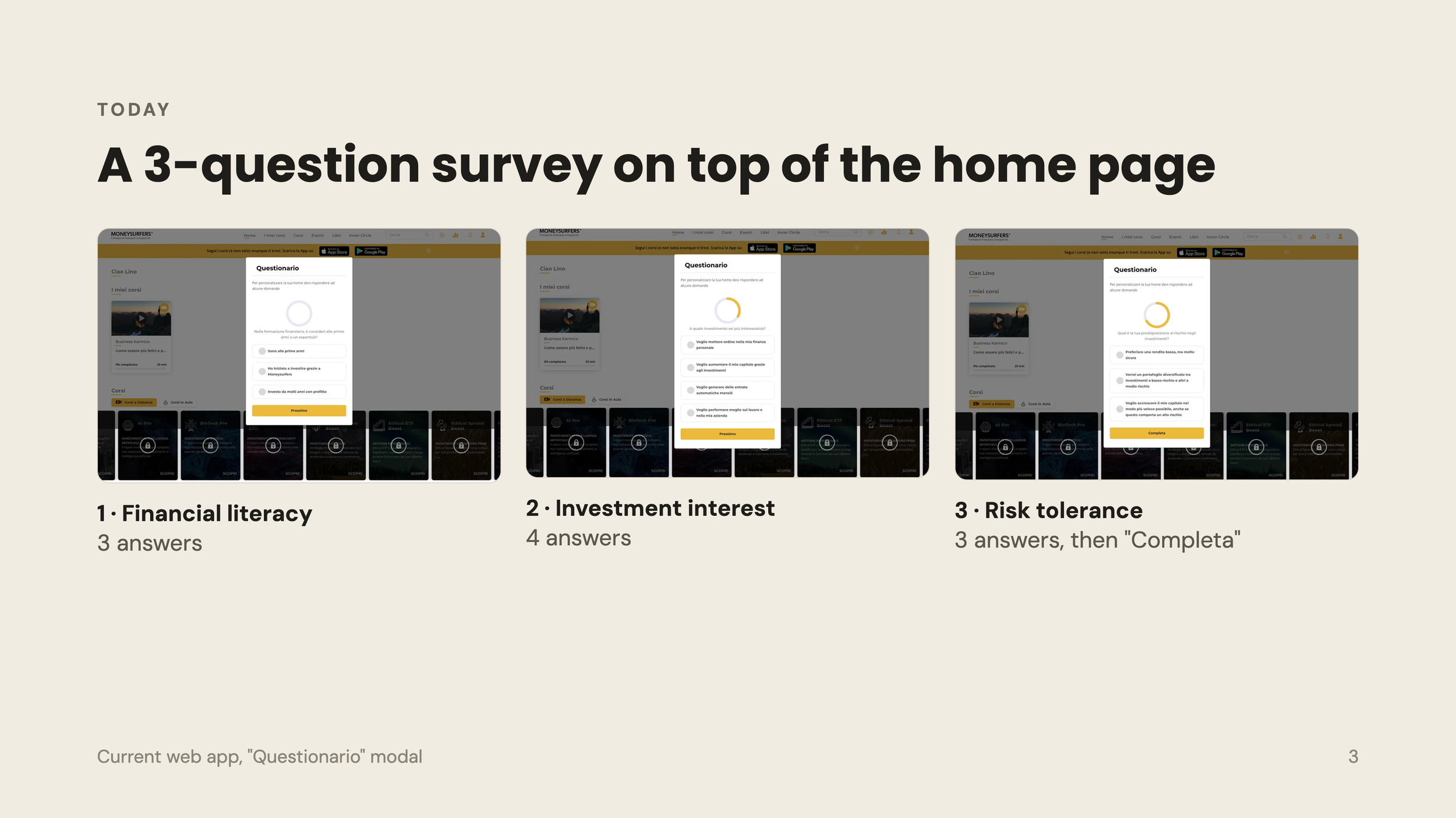
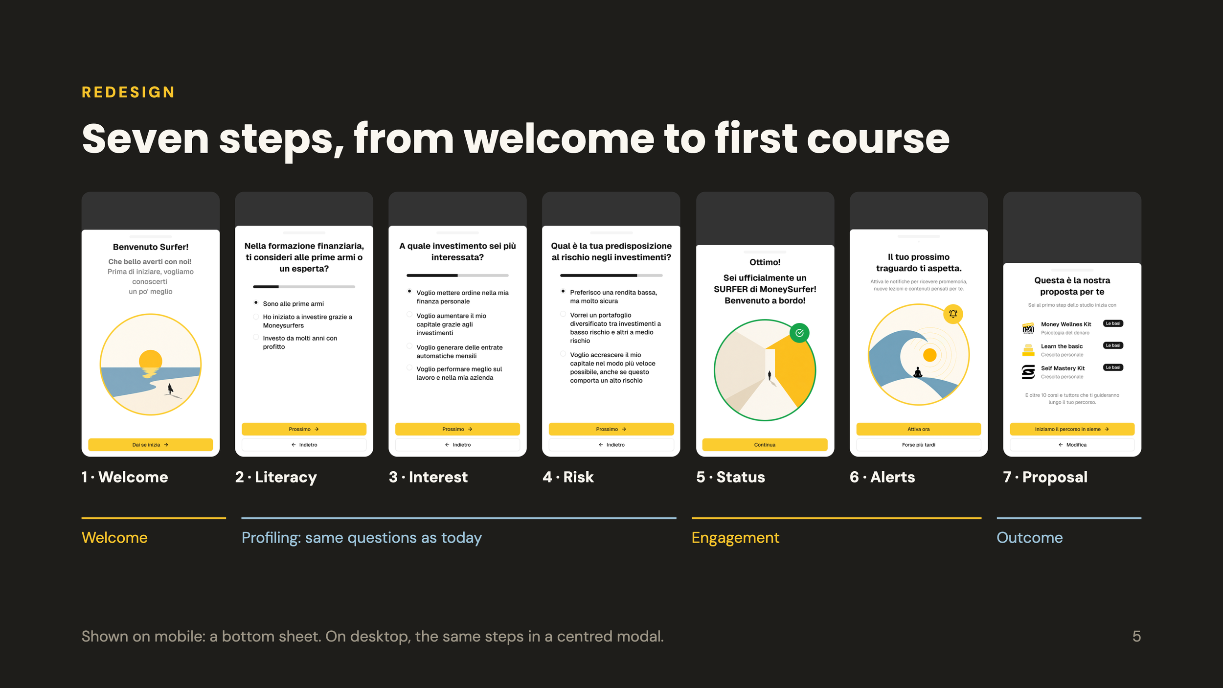
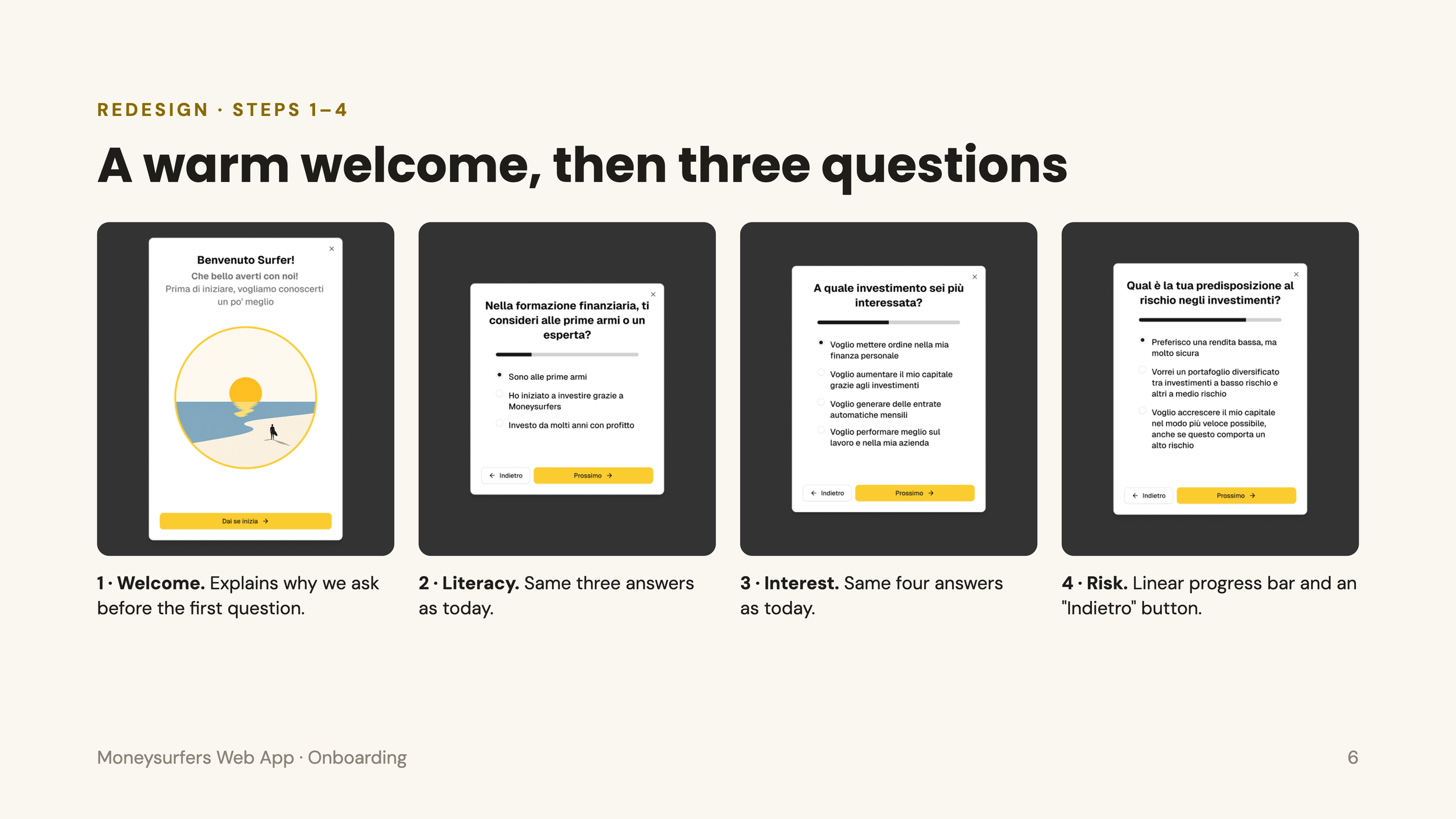
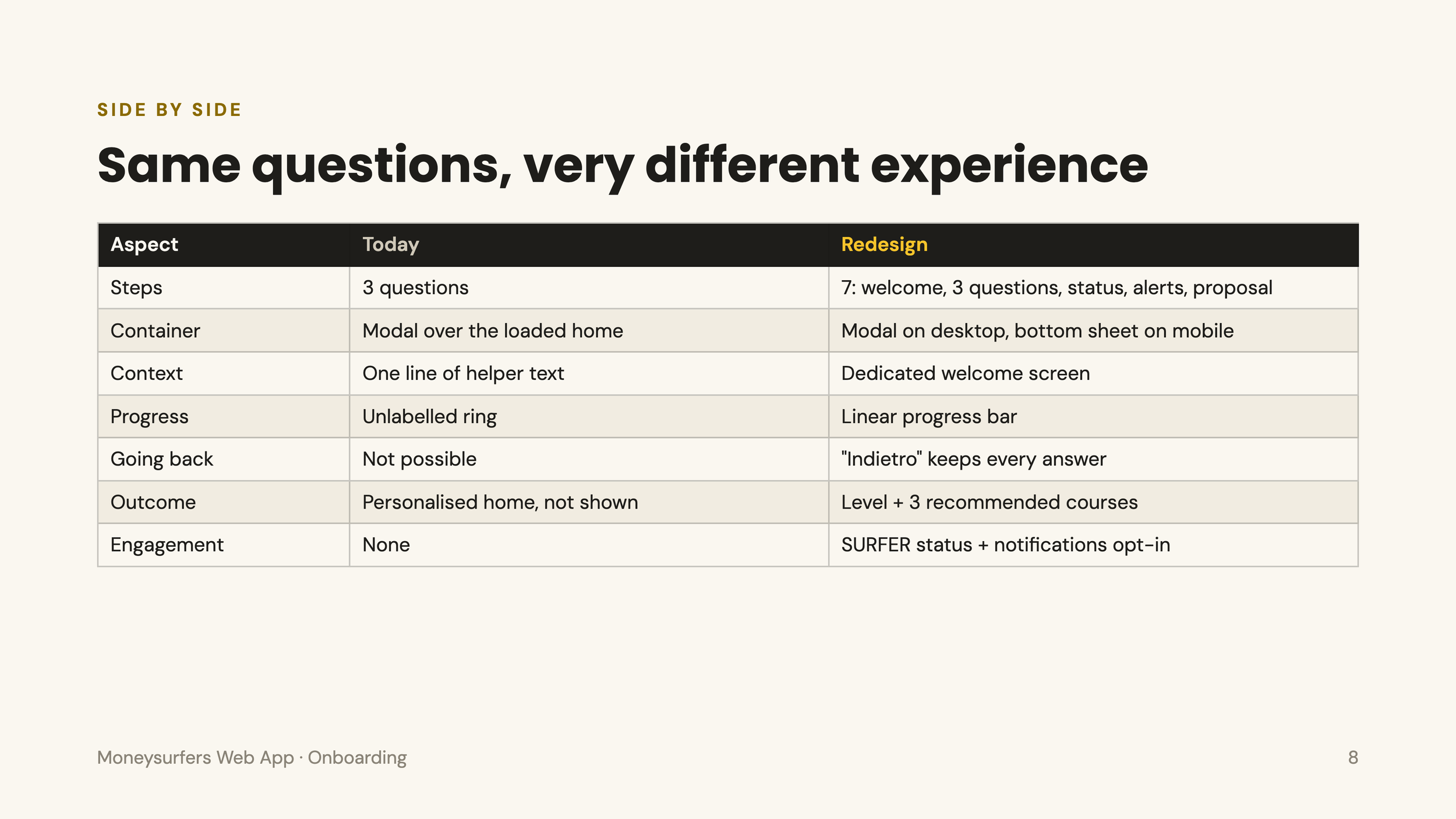
Users understand why they're being asked. Today the survey appears over the home page with one line of explanation. The new welcome screen ("Benvenuto Surfer!… vogliamo conoscerti un po' meglio") explains it before the first question, so it feels like an introduction rather than a test. That matters most for P-01, who is new and easily put off.
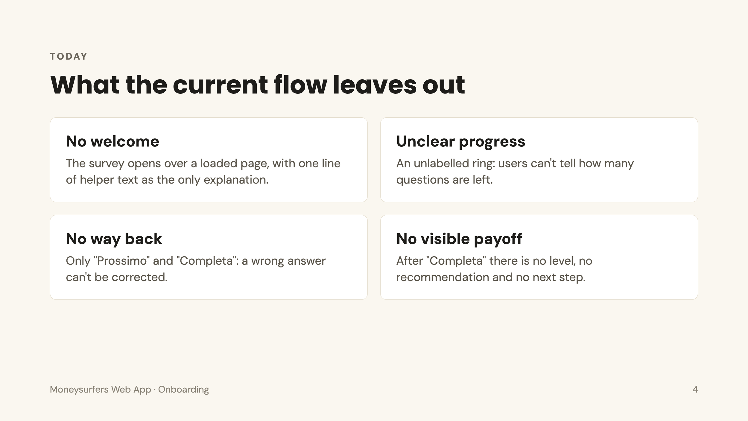
Users can see how far along they are. A linear progress bar replaces a ring with no label, so it's clear how much is left.
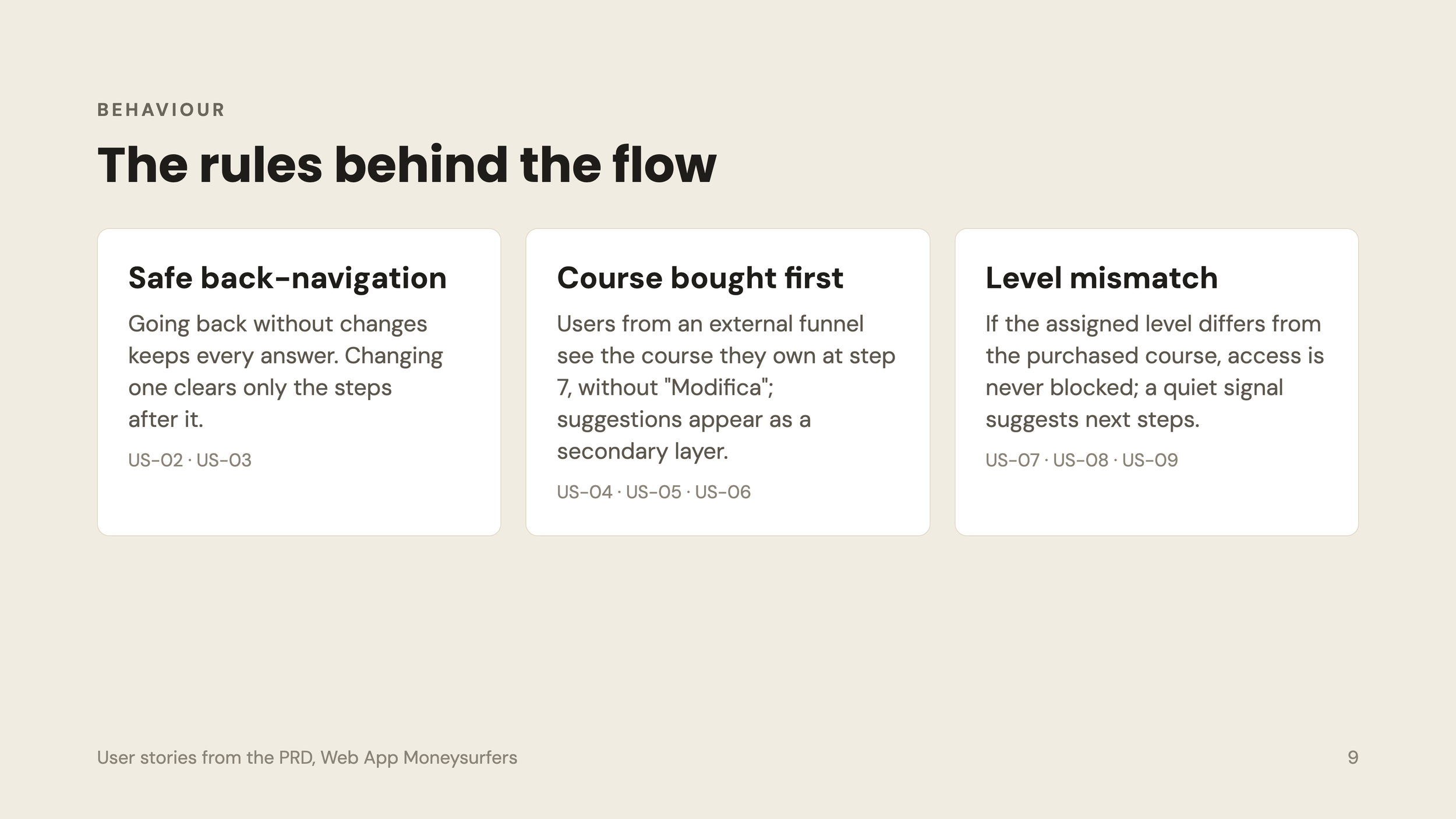
Users can fix mistakes. "Indietro" lets them go back without losing answers. Today a wrong answer can't be corrected, and a wrong answer means a wrong level.
Answering pays off visibly. Today "Completa" just closes the modal and the personalisation is invisible. Now the user gets a SURFER status, a level, and three recommended courses with a clear CTA. That ties the answers to a first purchase or a first course.
There's a reason to come back. Step 6 asks for notification permission at the moment the user has just been rewarded and is most motivated. Today there's no re-engagement hook at all.
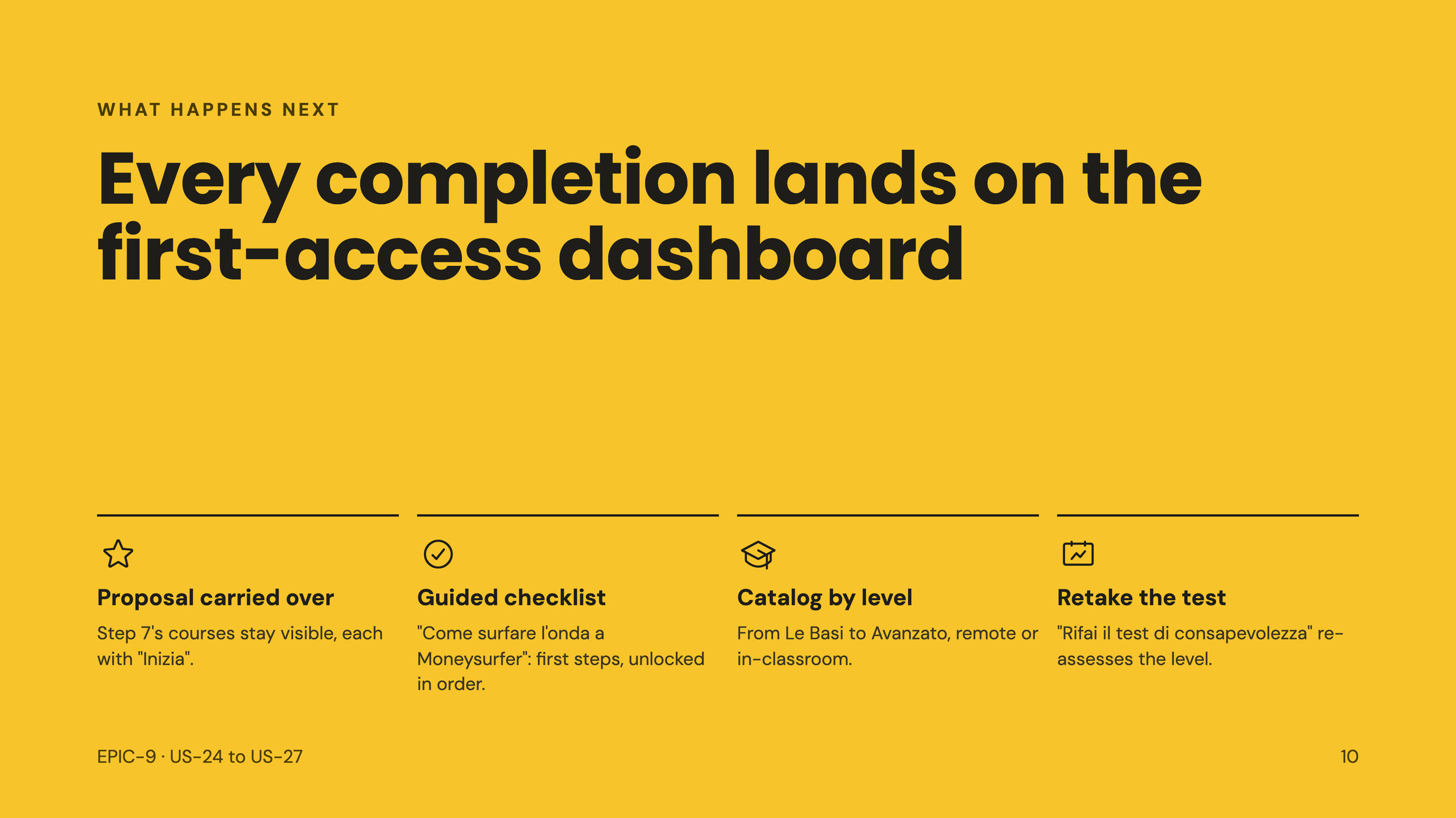
It continues after onboarding. The proposal carries over to the first-access dashboard, with a checklist and the option to retake the test. Today onboarding is a dead end.
It works on mobile. The bottom sheet is designed for a phone. The current modal is a desktop pattern.
